FOR CONTEXT
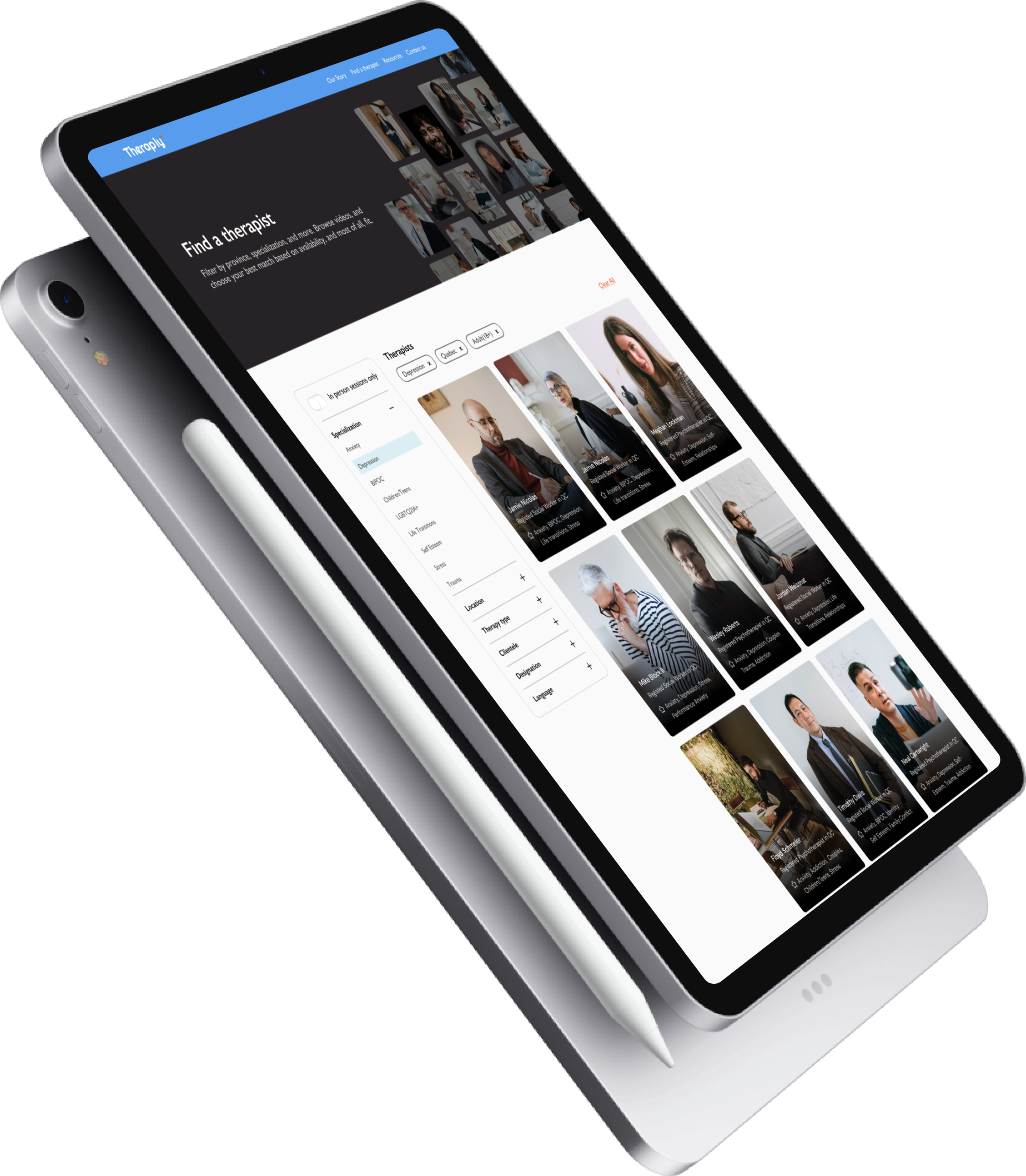
Theraply is a marketplace that helps connect people with the right therapist, the first time. I led the redesign of the website along with a team of five — including the founder, developer, content manager and another designer. The project engagement included designing the style guide, in-depth filtering capabilities, and improvement of the overall user experience.
PROBLEM
The goal was to get users to book sessions with therapists. Since the previous design was not built for scale, adding more therapists to the platform was making it increasingly difficult for users to refine their search. Furthermore, users felt that the visual design of the website felt too “clinical”; they wanted the website to feel uplifting and calming.
SOLUTION
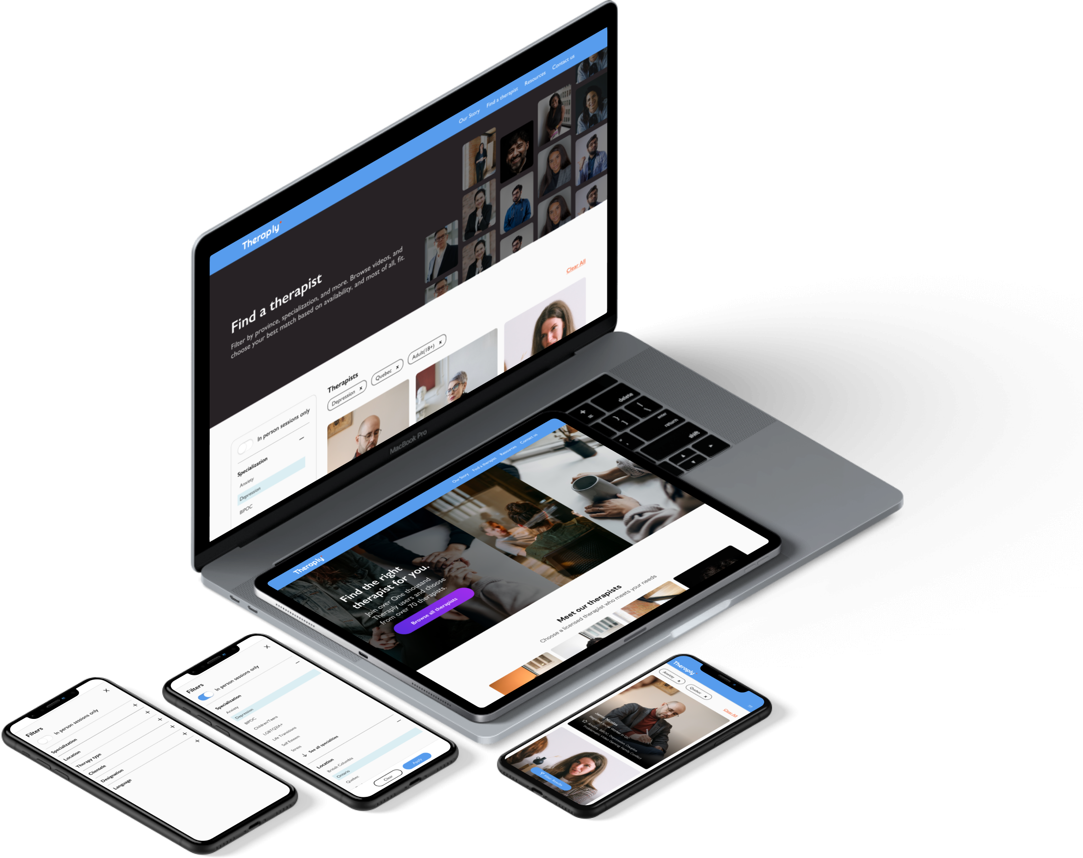
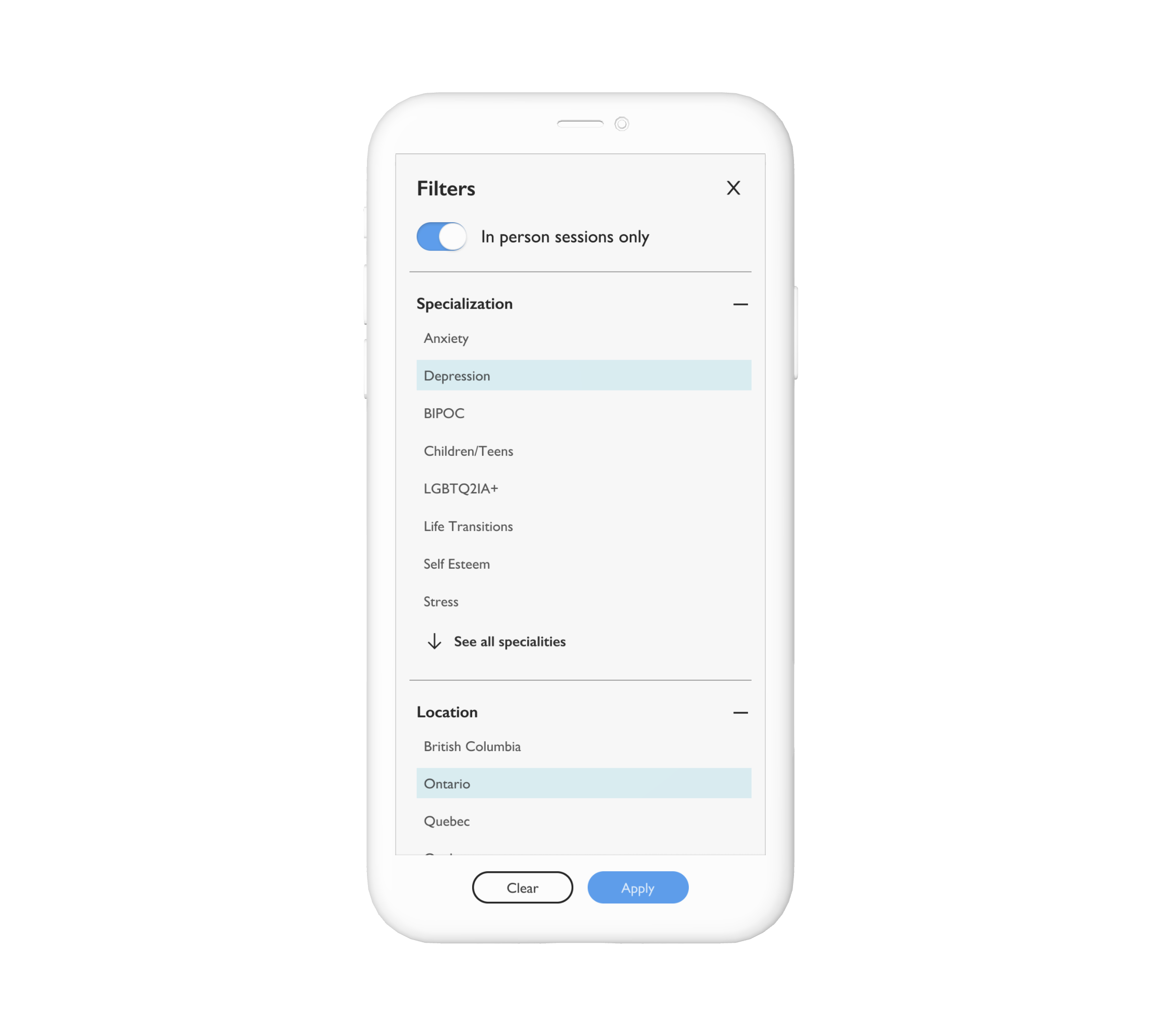
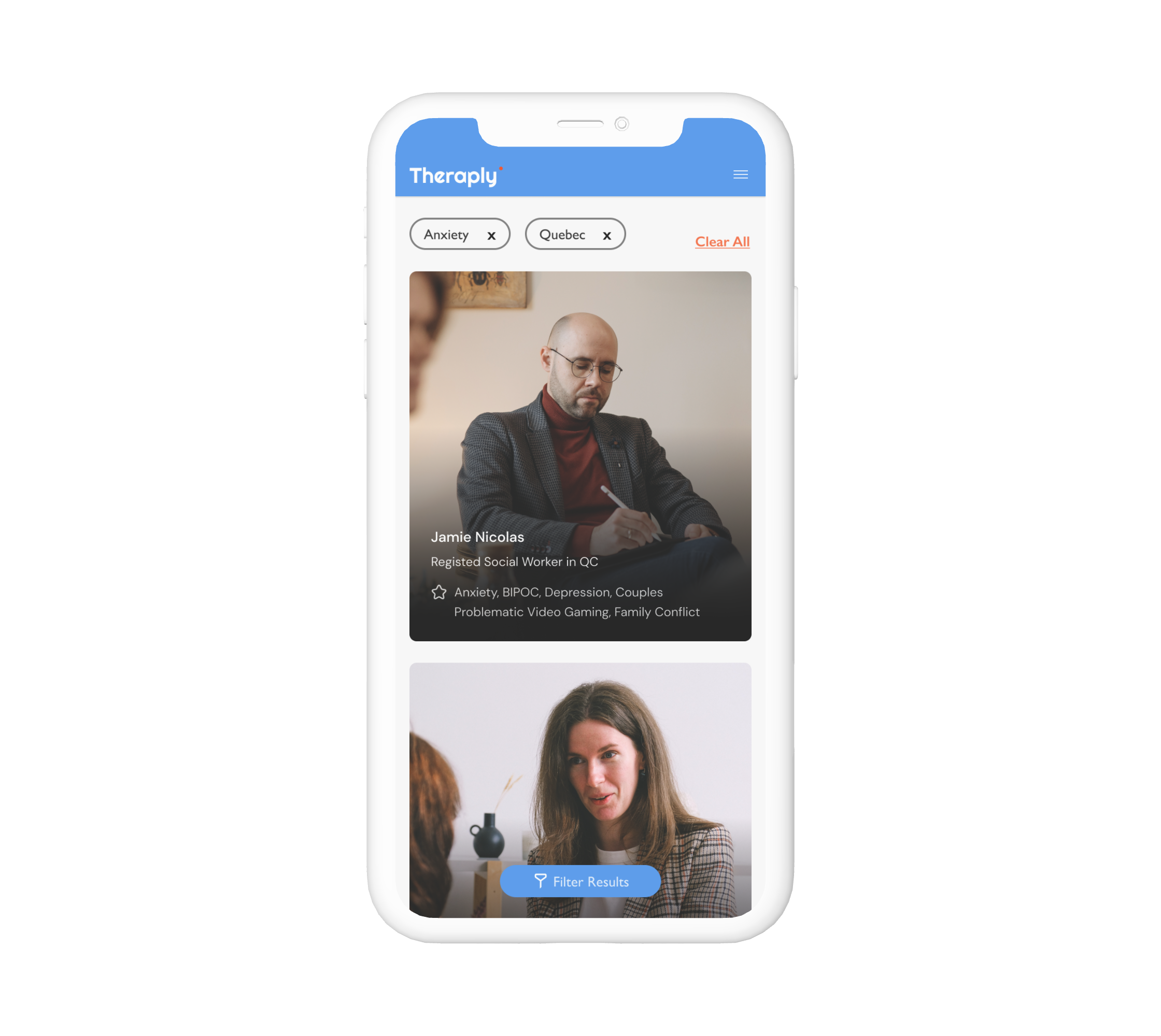
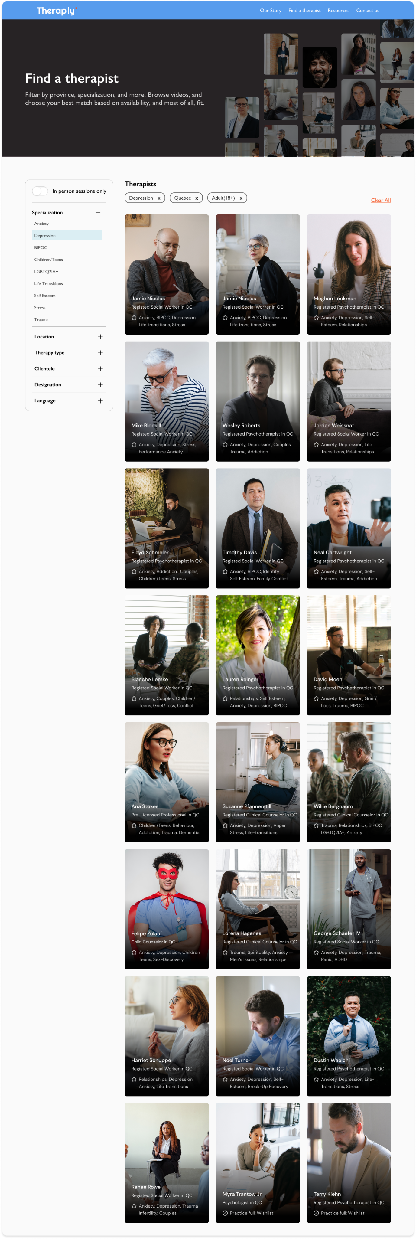
We gave users more in-depth filtering capabilities so that they could discover therapists who were tailored to their specific needs. Information hierarchy was restructured in order to make finding and booking a therapist more accessible. We also completely rebranded the website and created brand guidelines that helped ensure consistency across all of available channels.
ROLE
Product Designer
KEYWORDS
Responsive web, Redesign
CATEGORY
Healthcare
DESIGN TOOLS
Figma, Adobe CC
YEAR
2021
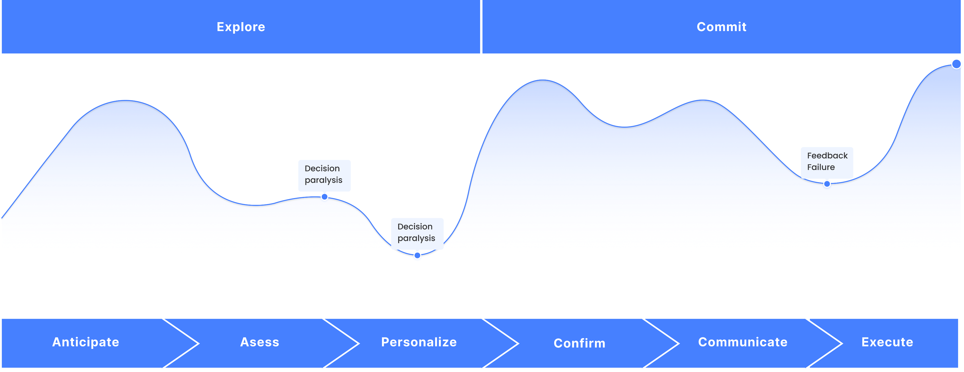
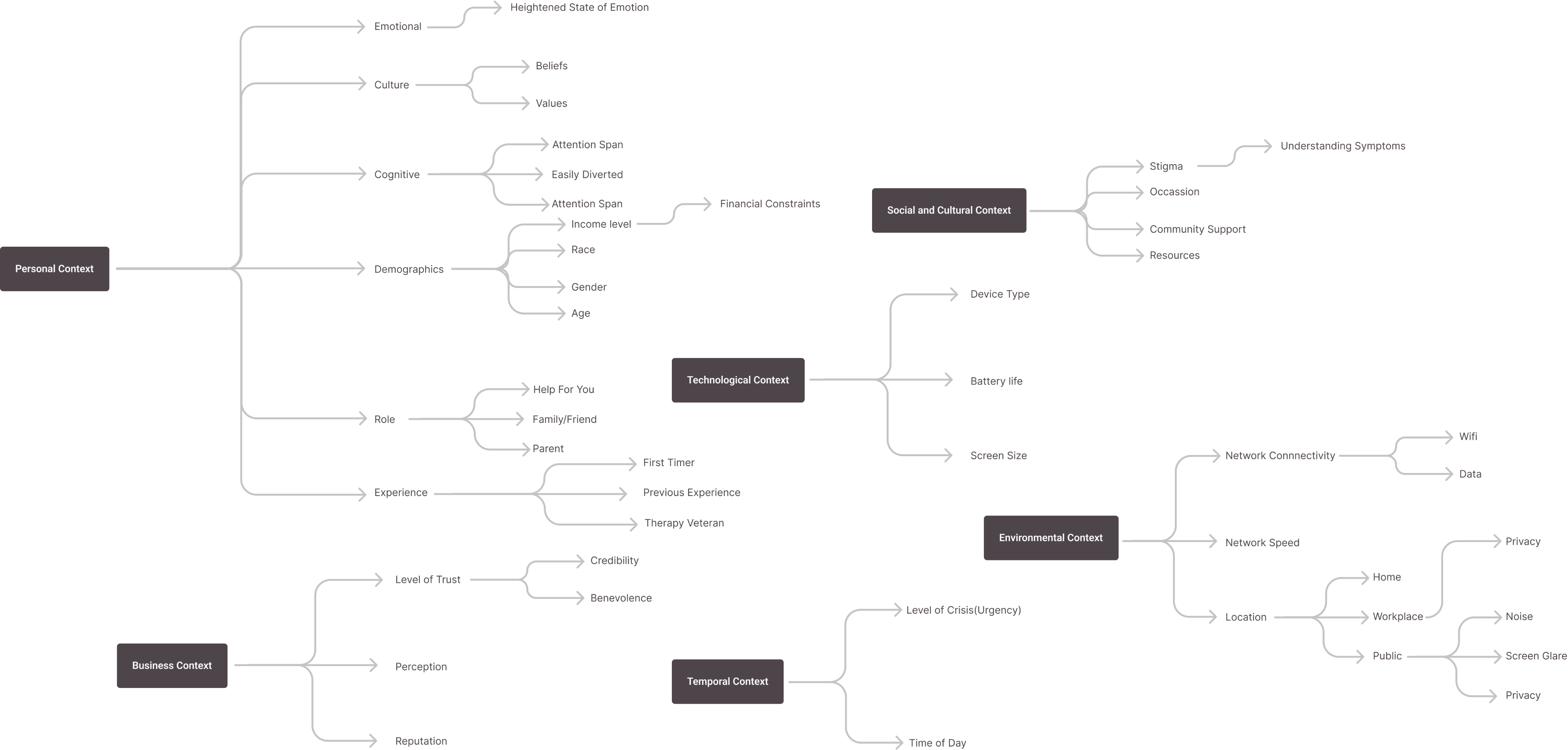
It wasn't enough to simply understand the client journey, however. I wanted to understand the different factors that were affecting their booking experience. To do this, I used the spectrums and situations framework adopted from Simon Pan's Uber case study (with his permission). This framework was an easily digestible way to organize and illustrate contexts and was pivotal in creating a more inclusive design.
This process was highly data-informed. We collaborated closely with our analytics consultant and therapist advisor to determine which filters should be focused on, what order they should be in, how we should name each filter, etc. It was also important to ensure that filtering was easily usable on a mobile device, as this format accounts for over 80% of the platform’s traffic.


FOR CONTEXT
Theraply is a marketplace that helps connect people with the right therapist, the first time. I led the redesign of the website along with a team of five — including the founder, developer, content manager and another designer. The project engagement included designing the style guide, in-depth filtering capabilities, and improvement of the overall user experience.
PROBLEM
The goal was to get users to book sessions with therapists. Since the previous design was not built for scale, adding more therapists to the platform was making it increasingly difficult for users to refine their search. Furthermore, users felt that the visual design of the website felt too “clinical”; they wanted the website to feel uplifting and calming.
SOLUTION
We gave users more in-depth filtering capabilities so that they could discover therapists who were tailored to their specific needs. Information hierarchy was restructured in order to make finding and booking a therapist more accessible. We also completely rebranded the website and created brand guidelines that helped ensure consistency across all of available channels.
ROLE
Product Designer
KEYWORDS
Responsive web, Redesign
CATEGORY
Healthcare
DESIGN TOOLS
Figma, Adobe CC
YEAR
2021
It wasn't enough to simply understand the client journey, however. I wanted to understand the different factors that were affecting their booking experience. To do this, I used the spectrums and situations framework adopted from Simon Pan's Uber case study (with his permission). This framework was an easily digestible way to organize and illustrate contexts and was pivotal in creating a more inclusive design.

This process was highly data-informed. We collaborated closely with our analytics consultant and therapist advisor to determine which filters should be focused on, what order they should be in, how we should name each filter, etc. It was also important to ensure that filtering was easily usable on a mobile device, as this format accounts for over 80% of the platform’s traffic.


FOR CONTEXT
Theraply is a marketplace that helps connect people with the right therapist, the first time. I led the redesign of the website along with a team of five — including the founder, developer, content manager and another designer. The project engagement included designing the style guide, in-depth filtering capabilities, and improvement of the overall user experience.
PROBLEM
The goal was to get users to book sessions with therapists. Since the previous design was not built for scale, adding more therapists to the platform was making it increasingly difficult for users to refine their search. Furthermore, users felt that the visual design of the website felt too “clinical”; they wanted the website to feel uplifting and calming.
SOLUTION
We gave users more in-depth filtering capabilities so that they could discover therapists who were tailored to their specific needs. Information hierarchy was restructured in order to make finding and booking a therapist more accessible. We also completely rebranded the website and created brand guidelines that helped ensure consistency across all of available channels.
ROLE
Product Designer
KEYWORDS
Responsive web, Redesign
CATEGORY
Healthcare
DESIGN TOOLS
Figma, Adobe CC
YEAR
2021

Unexpected primary action
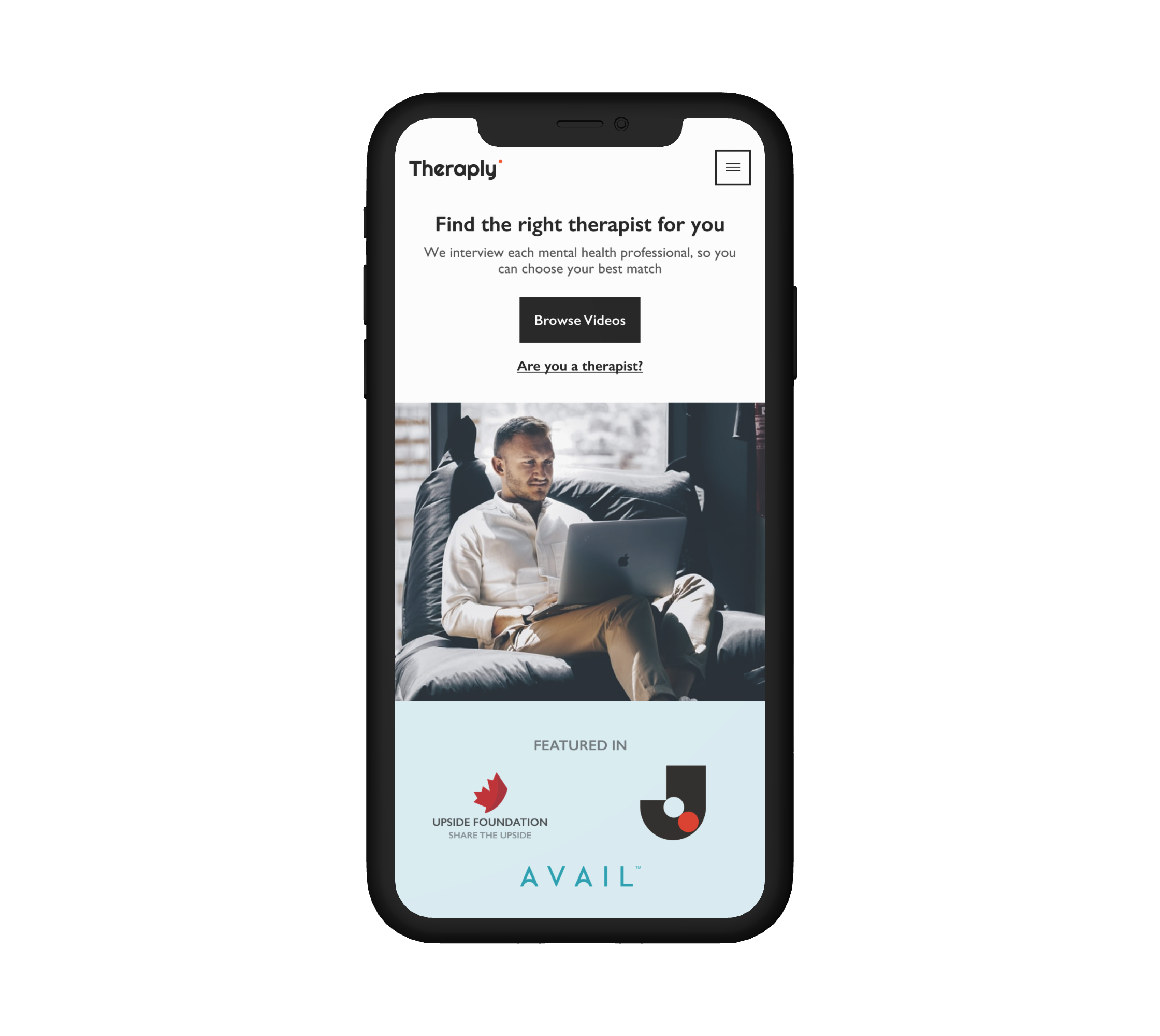
An initial audit with users yielded results indicating that they were confused by “browse videos” and how that call to action would aid in their search.
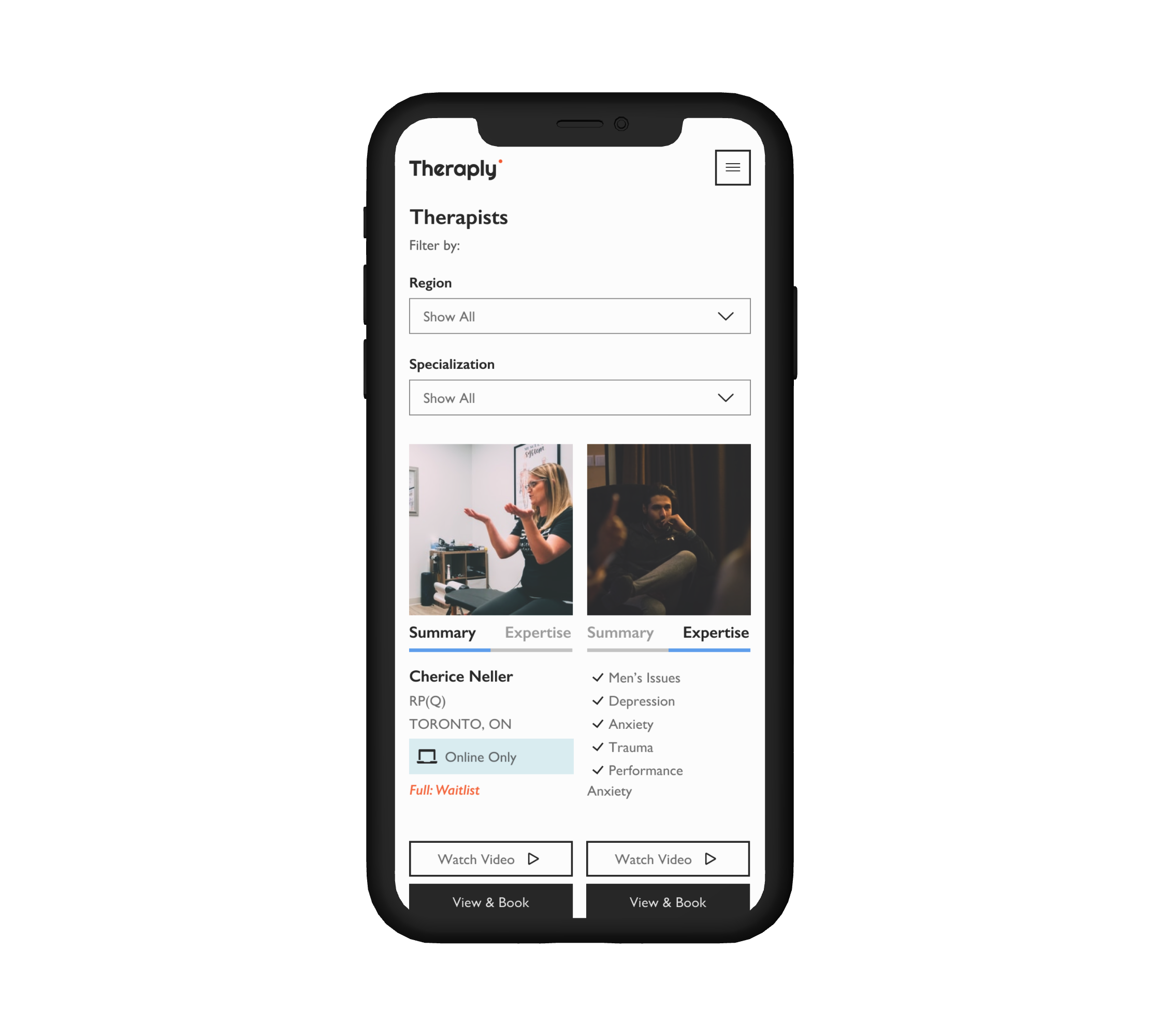
Content Overload
Users felt there was too much information for them to focus on and were unaware that “expertise” was a separate tab.
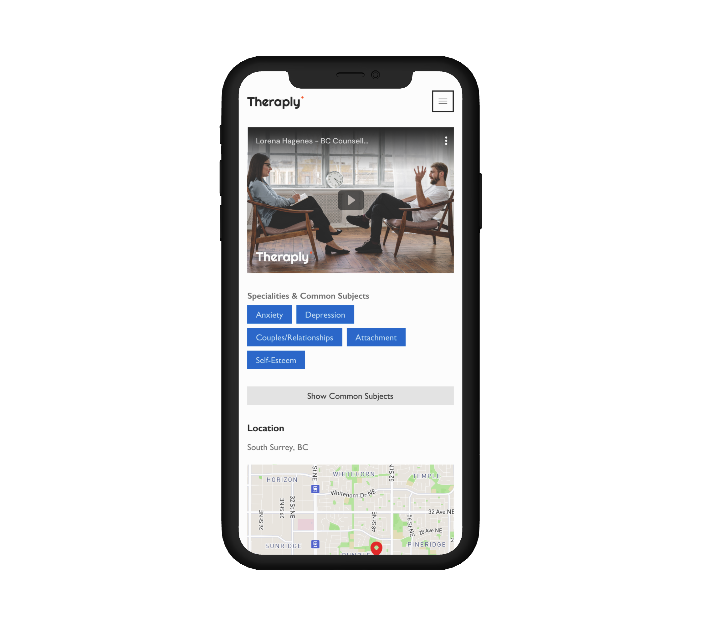
Suboptimal Conversion
While scrolling on individual therapists’ profile pages, users felt that the “book now” call-to-action was not visible.
It wasn't enough to simply understand the client journey, however. I wanted to understand the different factors that were affecting their booking experience. To do this, I used the spectrums and situations framework adopted from Simon Pan's Uber case study (with his permission). This framework was an easily digestible way to organize and illustrate contexts and was pivotal in creating a more inclusive design.

Relevant
Human
Effortless


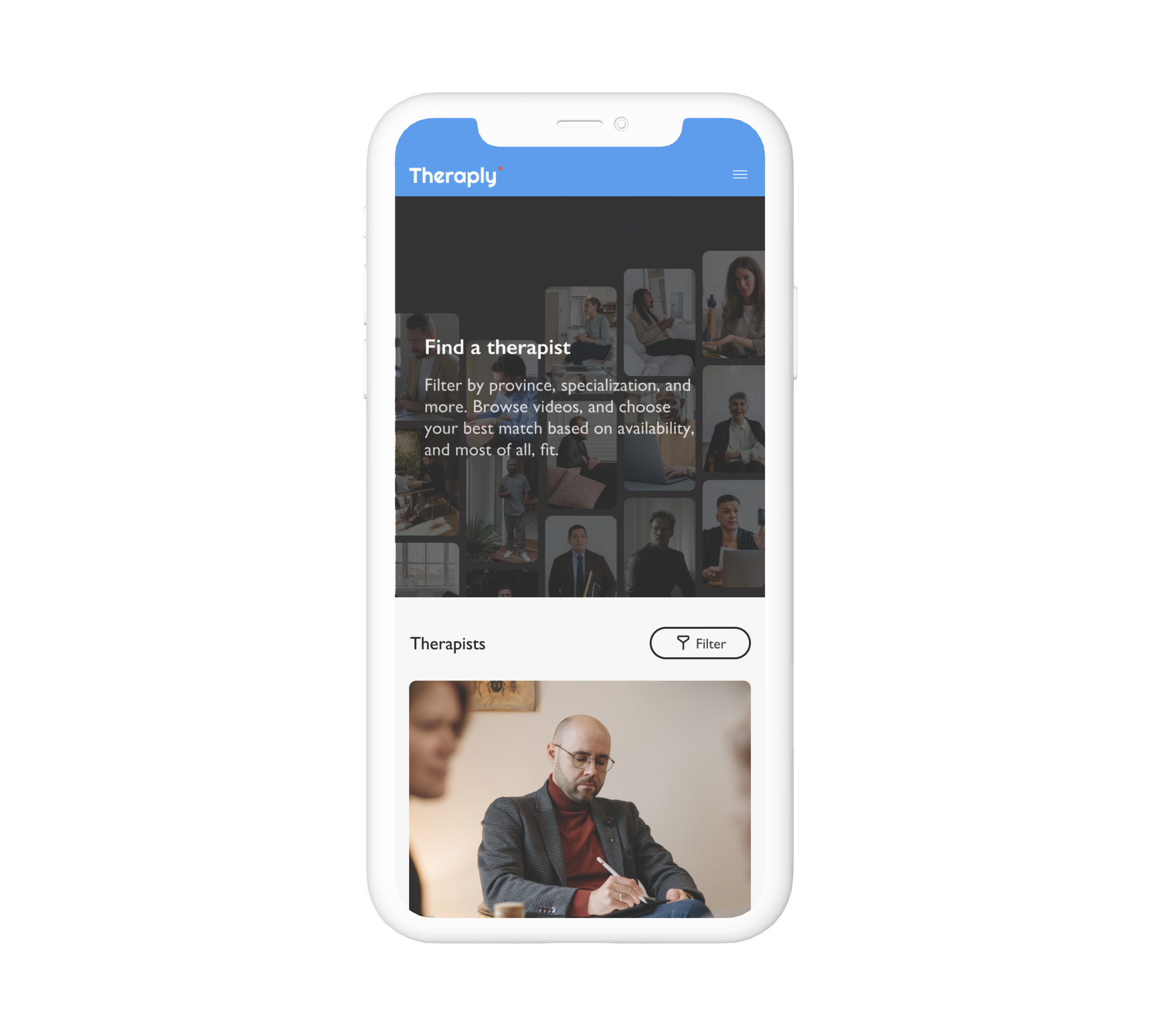
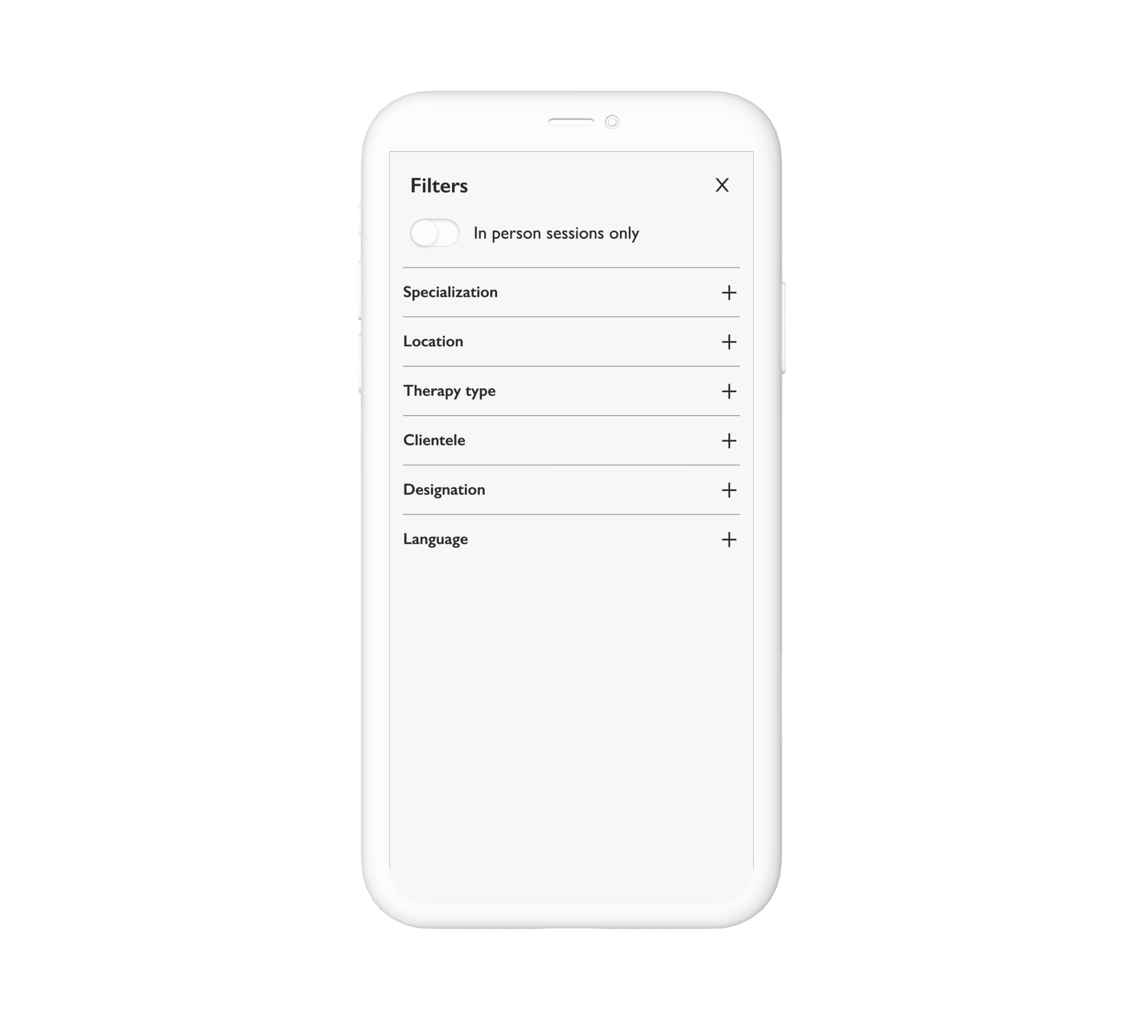
This process was highly data-informed. We collaborated closely with our analytics consultant and therapist advisor to determine which filters should be focused on, what order they should be in, how we should name each filter, etc. It was also important to ensure that filtering was easily usable on a mobile device, as this format accounts for over 80% of the platform’s traffic.
